Visual Rhetoric
A blog for my Visual Rhetoric class at BYU.
Monday, March 12, 2012
Layout: Part 1
Single Column Grid
Landscape Orientation
Portrait Orientation
Poor Use of White Space
Good use of White Space
Type: Part 5
Inappropriate Ling Spacing (Leading)
Outline Typeface
Pull Quote
12-14 pt. Typeface Used for the Body of a Text
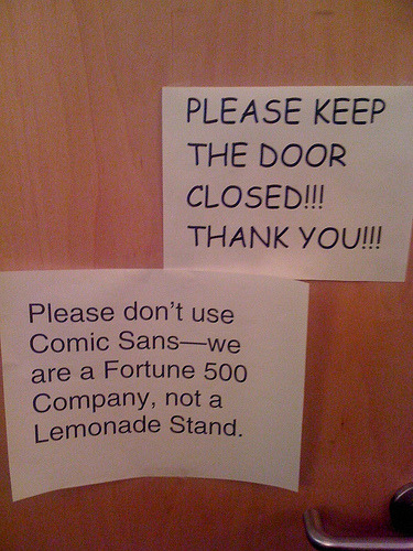
Ineffective Choice of Typography
Type: Part 4
Left Justification with Ragged Right Margin
Italic Type ("night")
Boldface Type
Small Capse ("Aredda")
All Caps
Type: Part 3
Center Justification
14 pt. size Typeface Used for Headings/Display
Serif Type Face ("work liquid" and "why why who how ism")
Sand Serif Typeface
Copyright Symbol
Type: Part 2
Appropriate Line Spacing (Leading)
Reverse Type
Right Justification
Kerning of Capital Letter
Script Typface
Type: Part 1
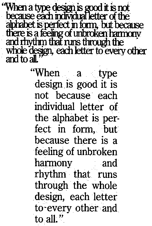
Full Justification
Colored Type
Novelty/Iconic
Effective Use of Typography
Bad Spacing Between Words (Bottom)
Tuesday, January 17, 2012
Visual Without Text
Newer Posts
Older Posts
Home
Subscribe to:
Posts (Atom)


 12-14 pt. Typeface Used for the Body of a Text